Reevaluating the Front End
Value is always changing. To the average consumer, it used to be based on the lowest-priced items. Now, value is less about the price tag and more about what is important to the individual shopper. Over the last 20 years, the front-end designs of grocery stores have gone through changes to keep up with consumer trends and behaviors. As we (hopefully) look into a post-Covid era, how will value continue to shift definitions for the average consumer?
In the past, power categories of the front-end were dominated by impulse buys: candy, beverages, and magazines. Most retailers also featured an assortment of general merchandise such as batteries, cellphone accessories, lighters, etc. The merchandising selected for the front-end is dependent on volume and quick movement, intended to capture consumers’ attention quickly. Impulse buys, such as candy, that elicit an immediate want, have traditionally produced the highest volume of movement. But as customers shift away from reading magazines and consuming chocolate bars to wanting healthier alternatives, what will the next wave of front-end designs look like and what will occupy their shelves? Moreover, will there even be shelving in the future of front-end designs?
One of the largest trends accelerated by Covid was the growth of self-checkout. Throughout the pandemic, values shifted for customers: they desired fewer interactions and a quicker in-and-out of the store. Self-checkout unit installments had already been increasing in stores prior to the pandemic, but with this shift in values, contactless transactions became more popular than ever. On the retailer end, the increased usage of self-checkout not only helps reduce labor costs on the front-end but also helps customers flow through the store much faster.
As self-checkouts continue to grow in popularity, some retailers are looking to remove cashiers entirely. Retail giant Walmart is testing a redesign in one Arkansas location with no traditional check-lanes in sight. Instead, there are 34 registers that line a bullpen-like area. The idea behind it? A faster, more personal checkout experience. This interesting concept is being labeled as a full-checkout experience with Walmart’s goal to turn checkout from a transactional experience to a personal one. Without having experienced it for ourselves, we can’t quite comment on whether or not this newly designed front-end lives up to its promise. The idea of a largely un-assisted checkout experience is appealing to shoppers who want the in-and-out. But does it hold the same appeal for customers whose value isn’t on time?
As a single, 23-year old, I’m all about the in-and-out; A faster transaction, less interaction, help accessible- but only when I need it. But if you flip the script and add four kids under the age of 7 to my trip, I’m not sure if I’m so keen on checking myself out anymore. My values shift. In the first scenario, my value as a customer, is placed on efficiency. My values in the second scenario, are about ease. The easiest way to move my kids AND shopping through, without losing any of either.
Another interesting aspect of Walmart’s new design is the erasure of shelving within the area. With no beverage coolers, candy shelves, or magazine racks insight, companies that depend on the impulse buy, may have reason to worry. With a front-end designed to eliminate any queueing at all, what locations will retailers turn their attention to make up for lost revenue?
After researching various front-end designs that are emerging, our VP of Creative and Marketing, Jim Wiemer, has come up with three concepts that open up the front end with shorter queuing period and more compelling displays, balancing customer flow and customer engagement, while retaining a home for the impulse buy.
Each concept uses best practices of retailing to show focal point display beacons in all concepts that draw attention and break up the fixture configuration. All concepts are meant to be nimble for the retailer, based on the knowledge that customers want an express route out of the store. Even with self/express check out, there is still a bit of queue line. If curated with the right products and placed in the store properly with proper sightlines, these can add value to the retailer and customer alike. Customers will also have their phones in hand, so mobile-based technologies can be utilized show last minute deals and more.
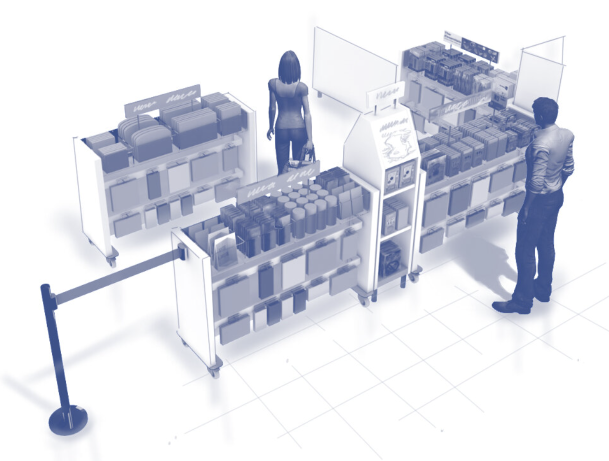
Concept 1 uses mobile fixtures that can quick reconfigured. Flexible display features allow for the accommodation of various products. In addition, the mobile fixtures can be themed and use the engagement of technology to inspire, engage or inform.

Concept 2 is more pod based and can be themed to attract the customer to relevant product groupings, intended to inspire impulse purchases or last-minute convenient items. The use of shadow boxes or hot spots highlight a given product based on the theme presented. The pods can be placed at the entry of the self-serve or cashier lines, in the main aisle or be their own destination at front of store entry to promote specials and impulse purchases.

Concept 3 use a thin panel fixture with cabinet-like towers that hold highlighted product, graphics or technology. Sections can be themed to have various themes to connect to customer. This is a flexible concept that can be quickly arranged to the needs of the retailer.
As the pandemic evolves, front-ends will continue to change to accommodate preferences of both the shoppers and retailers. Brands and retailers have a huge opportunity to explore where impulse goes next, as well as experiment with different merchandising solutions.